LAYOUTS & EVENTSAdobe Illustrator +
Adobe Photoshop
My first love in design, and what remains my passion:
Print Design
As design takes a large step into the digital, my love for the CMYKs, large format printing, the smell of ink on freshly produced paper, the texture, and more. All that remains as my foundation in design. The start of designing in print takes a different approach and considerations. For example, how vibrancy of colours can change based on the mediums, the sizes and scale of prints, the contrast of fonts and lines, the shift in visual and typographic hierarchy, and so much more. Above all, my priority in the expanding digital age is to keep the consistency between print and digital.
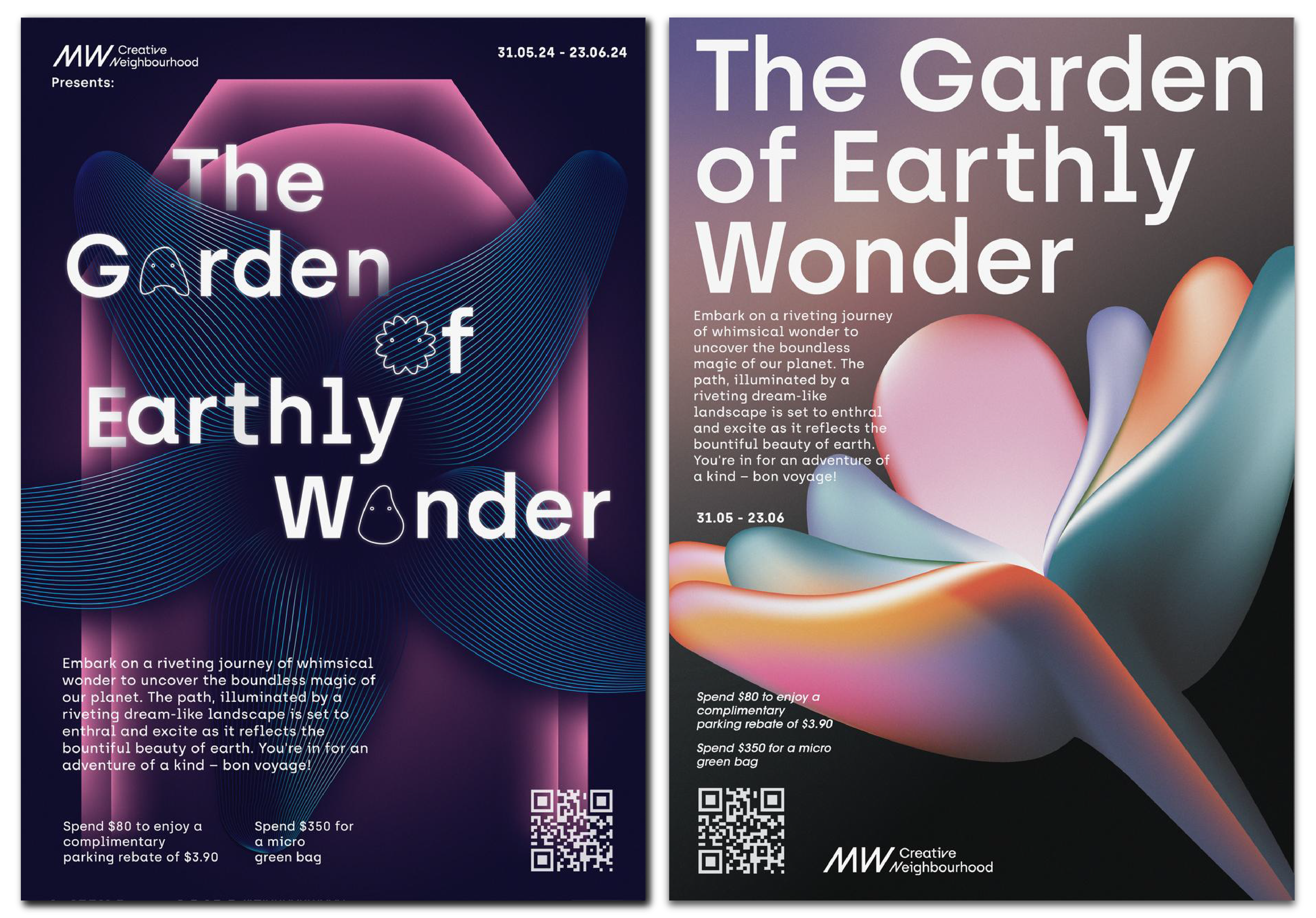
Project: iLight x Millenia Walk Creative Neighbourhood
-
Project: iLight x Millenia Walk Creative Neighbourhood -
iLight x MWCN
Event KV + Prints +
Digital Marketing Assets
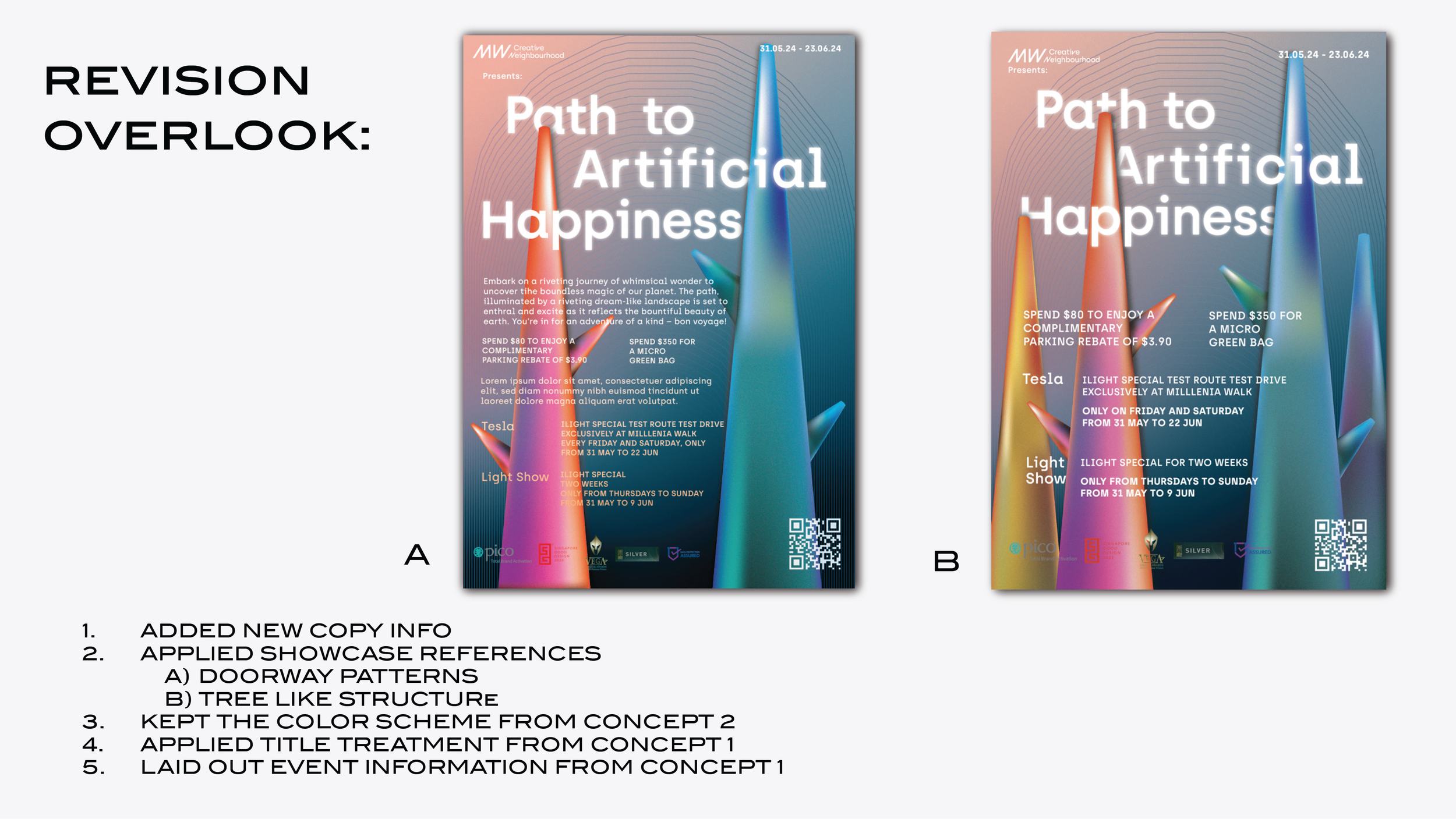
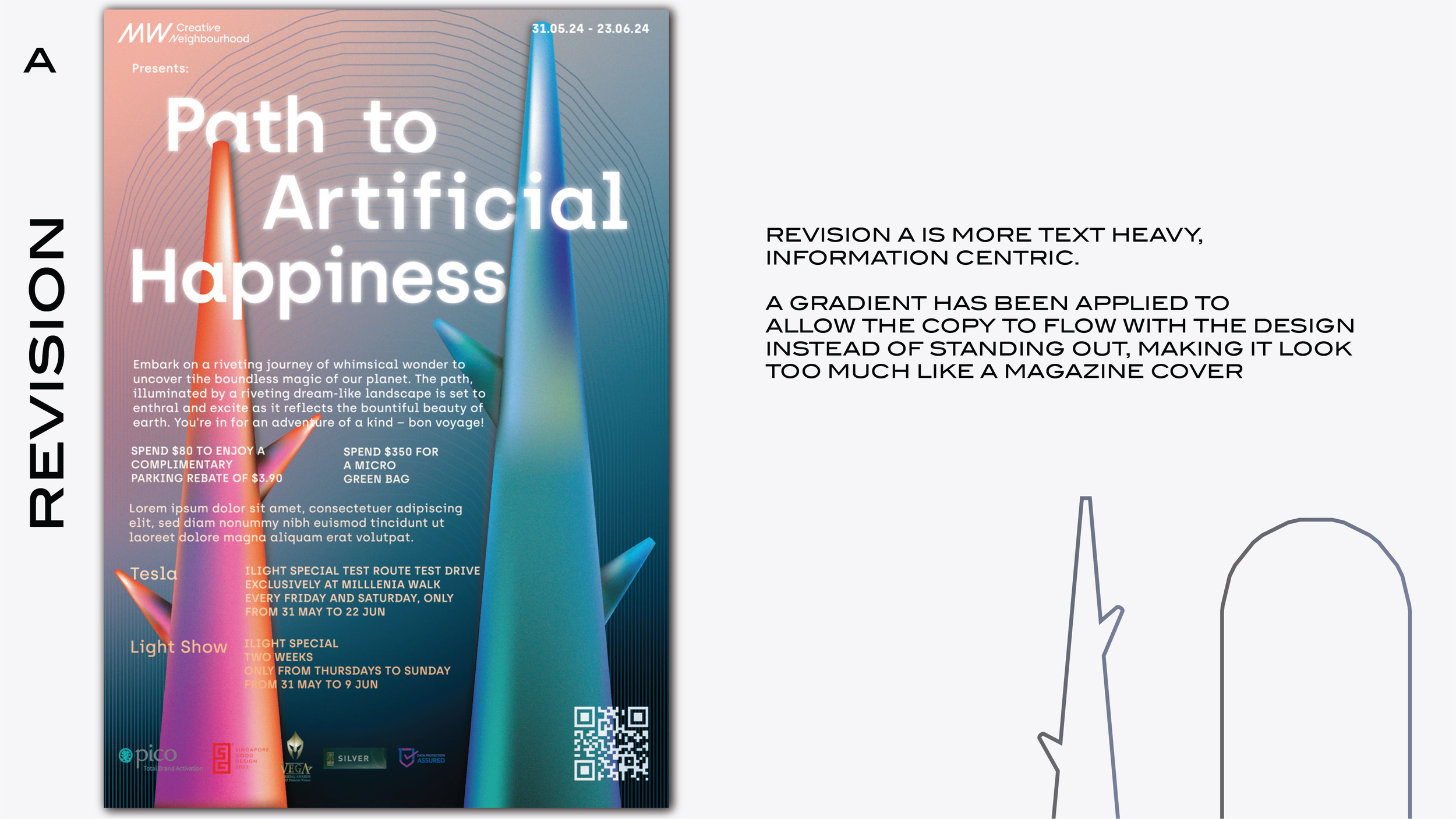
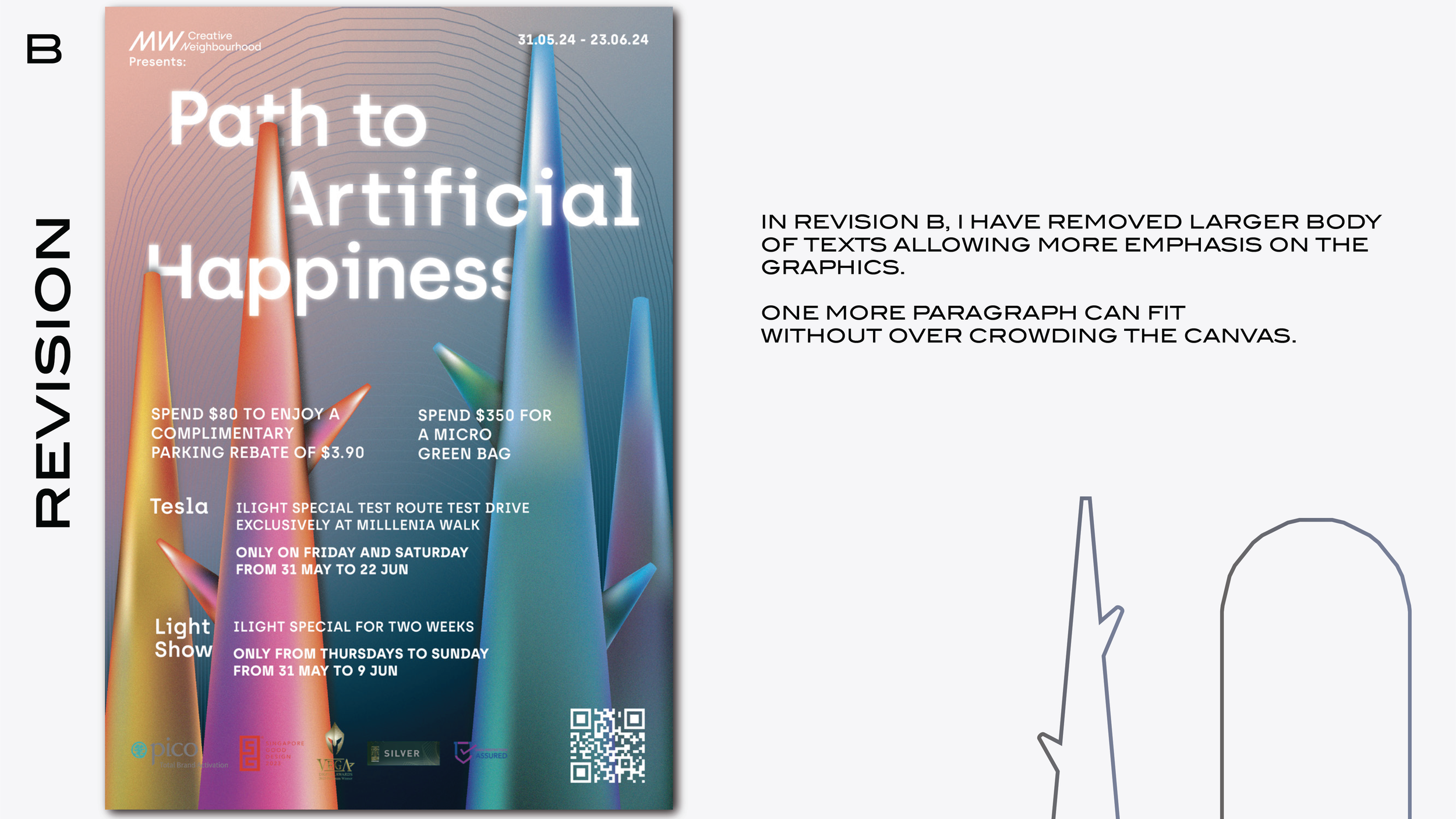
Millenia Walk, Singapore, hosted one of i Light’s exhibition. They approached with the brief to adopt the event’s mood. Their specific brief was to show that it is about Light, showcase elements of the exhibition’s motifs - an abstract blowup light garden which utilises lines and specific themed colours..

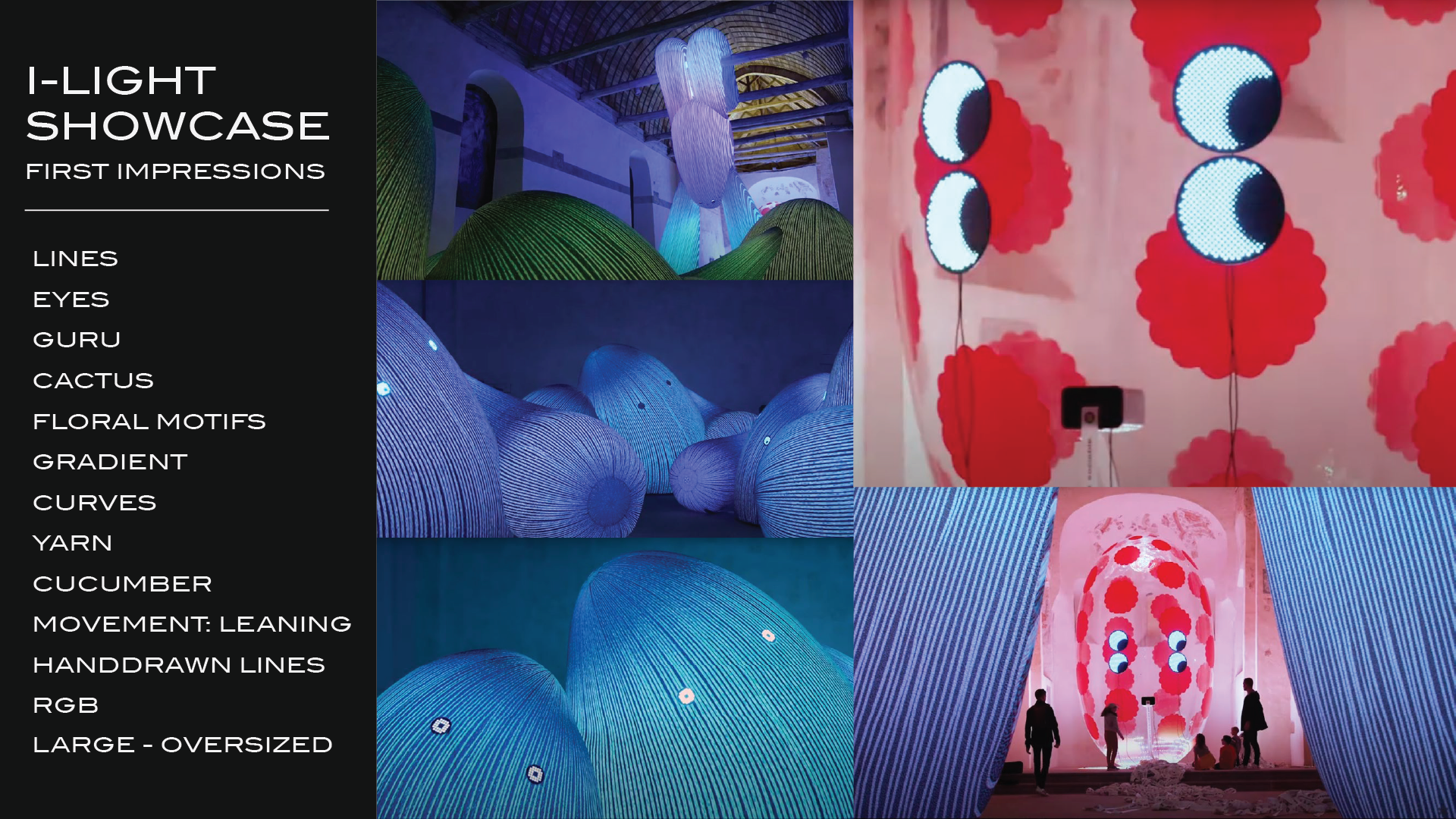


Custom illustrations. Gradients and the contrast of colours were used to illuminate and elevate the print designs that were going to be on elevator doors, sliding doors, and banners. The play of high contrasting light and dark tones is a trick to create the illusion of light when working with mediums that are light absorbent - unlike screens which emits light.
Drafts


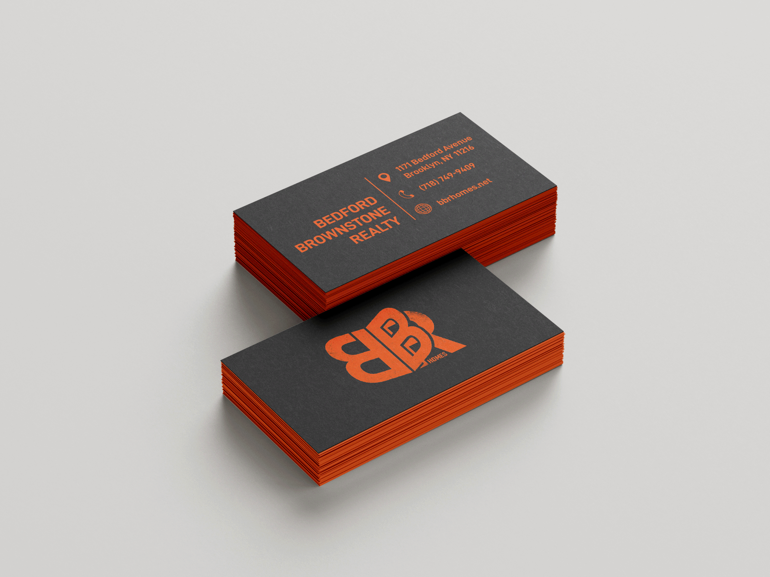
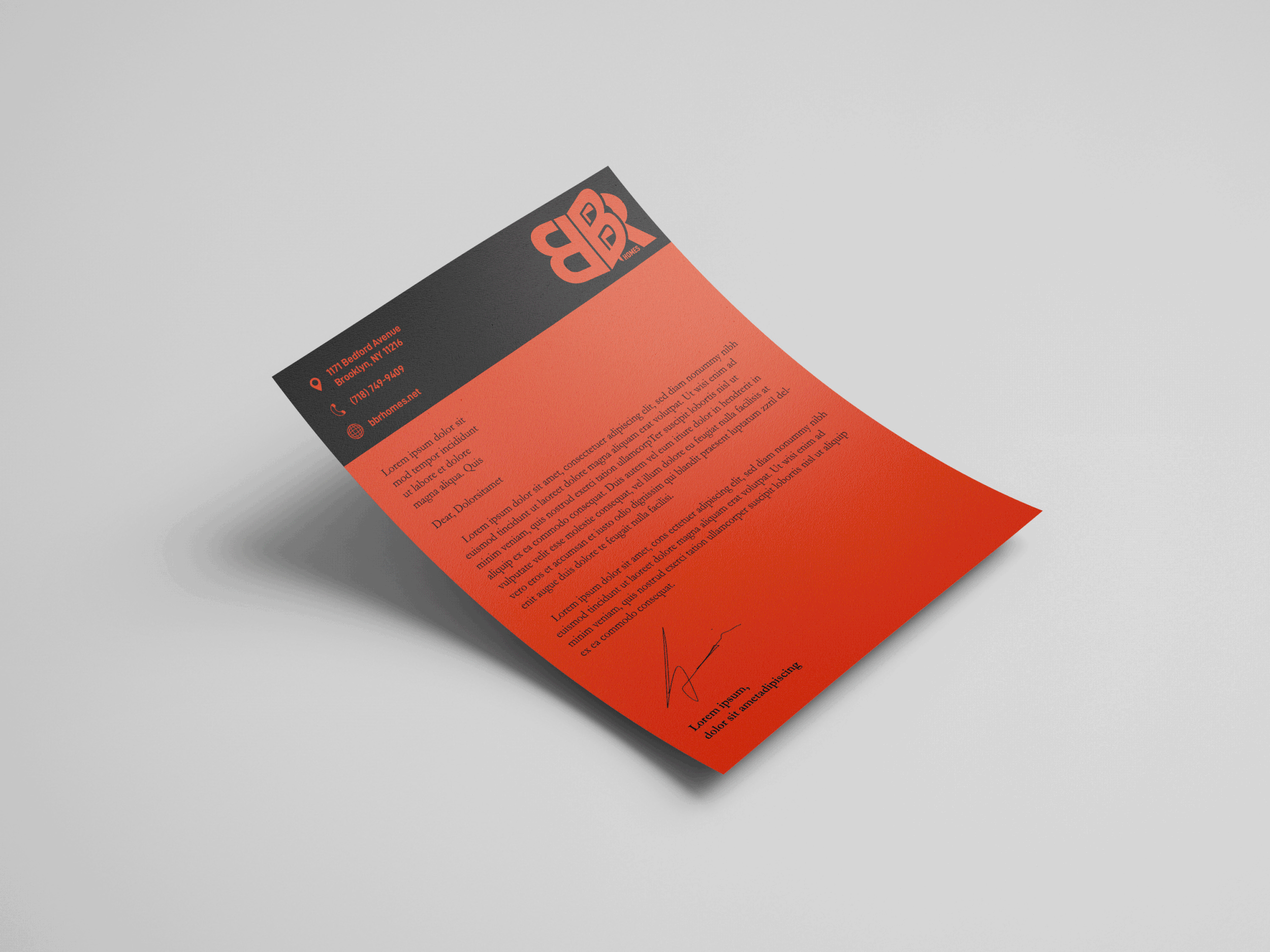
Project: Bedford Brownstone Realty
-
Project: Bedford Brownstone Realty -
Business Card +
Letter Head Design
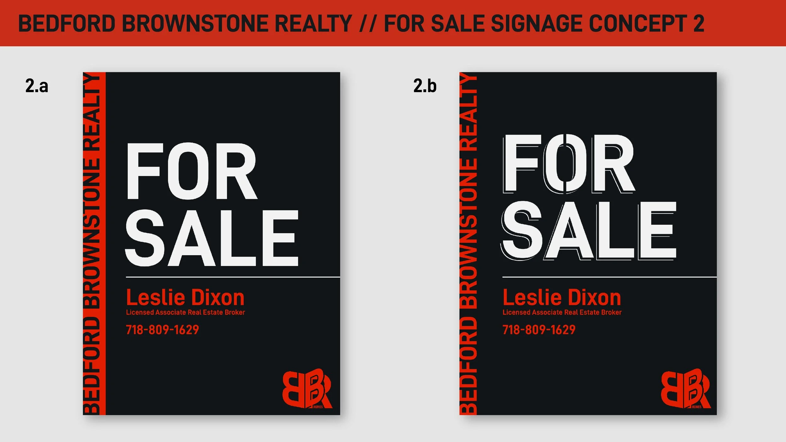
After designing their Logo, BBR requested for additional layout designs to help them keep their brand consistent. Keeping it to the owner’s original mood for this brand.
ON SITE FOR SALE BOARDS
BUSINESS CARDS
WINDOW DISPLAY PROMOTIONS
LETTER HEADS
As part of rebranding, BBR Homes got me to apply the Logo’s aesthetics onto the rest of their company. I created templates for their window display promos, business cards, For Sale boards, and letter heads.


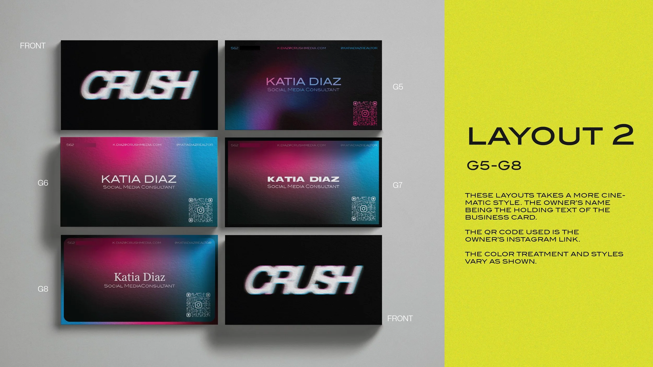
Project: Crush Media
-
Project: Crush Media -

Business Card + Letter Head Design
Here, you’ll see everything from the first brand proposal through to their letter head designs.


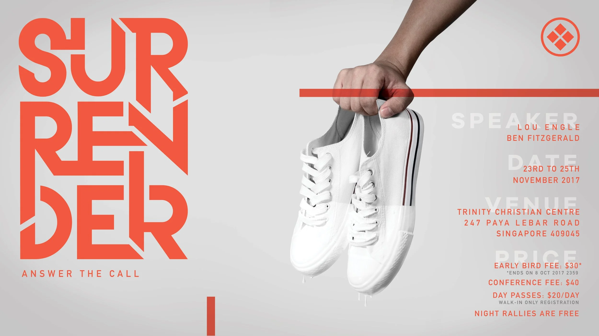
Project: Festival Of Praise X
-
Project: Festival Of Praise X -
FESTIVAL OF PRAISE
2016, 2017, 2018
Event Logo + Print Posters + Digital Marketing Assets
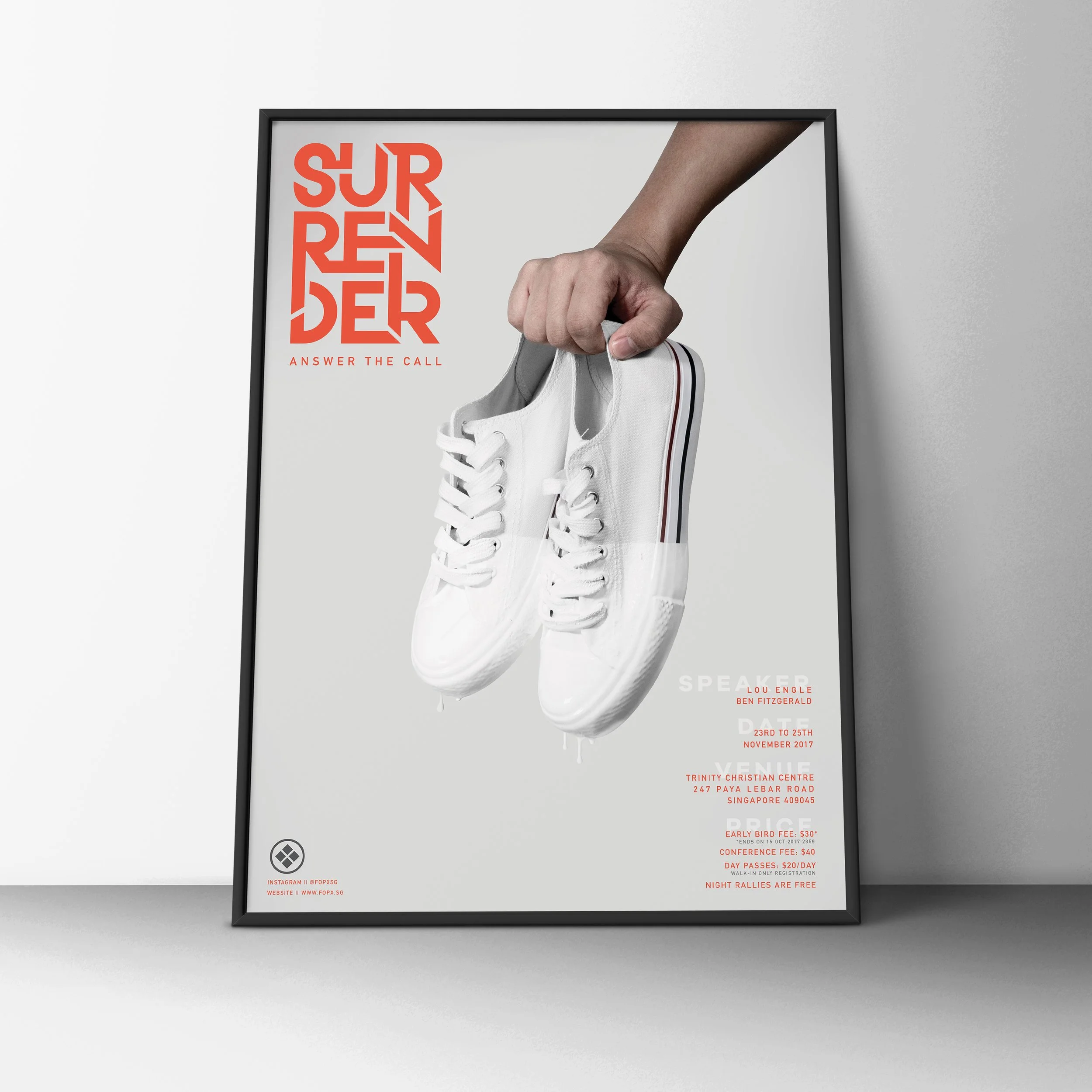
Festival of Praise X (FOPX) is a community event organised by various churches and denominations in Singapore. Their logo is designed to be bold and timeless. Later, they approached me to design their first few events. The age of the audience ranges from 12 to 40, the difficulty was to employ designs that would be relatable to such a wide range of visual influences.

A logo that is build to last and remain relatable for generations. an ‘x’ that is formed by the divide of equal square parts resembling different denominations of christianity, while staying united within their faith - the circle.

WILL YOU BE MARKED 2018
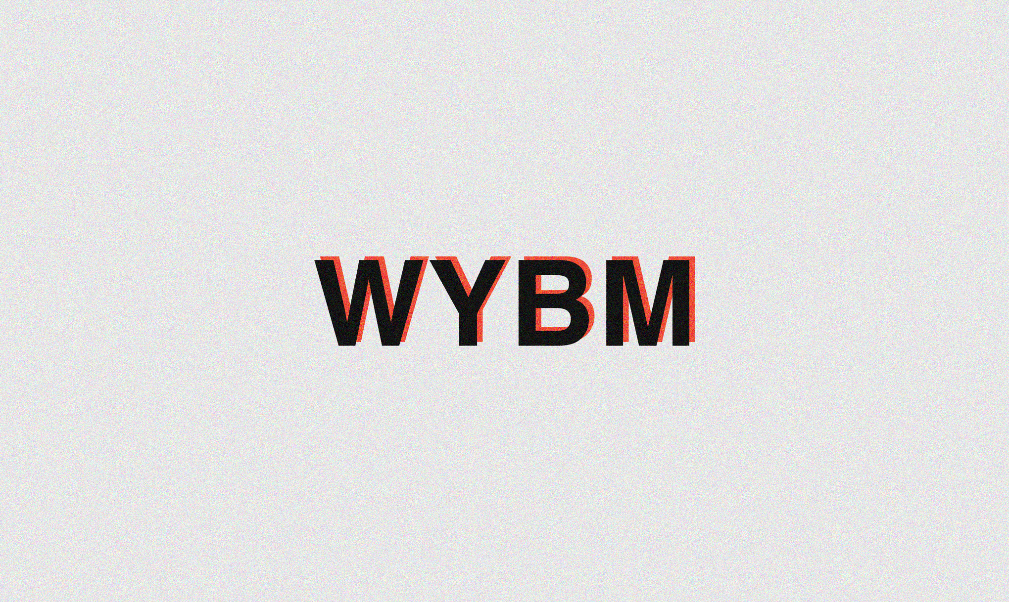


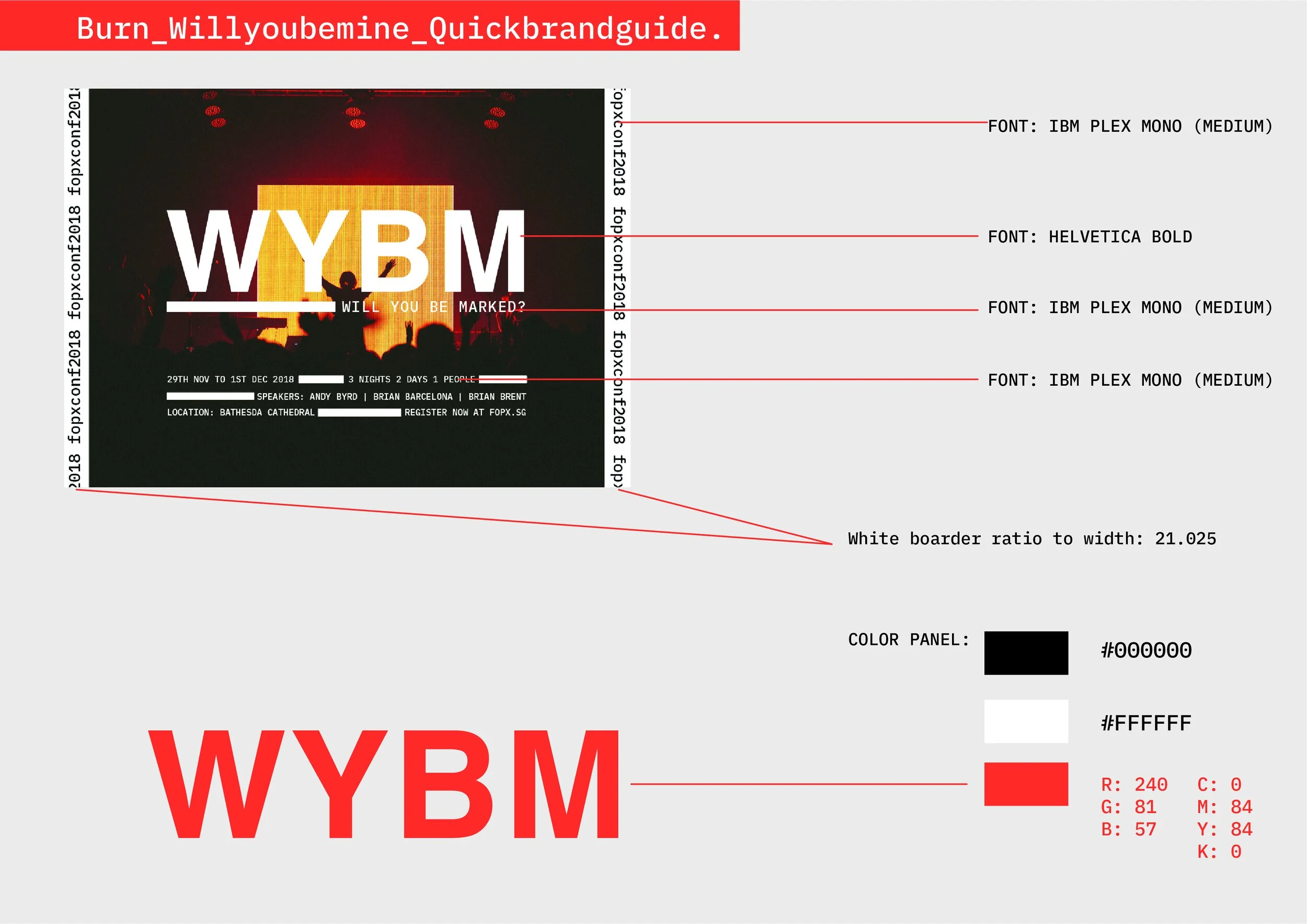


The aesthetics FoPX wanted was digital, modern, and clean. I decided to propose a tri-tone/hue approach. Courier-like font + bold san serifs were used to support the overarching aesthetics. My idea was to let colours hold the design instead of typography and photography.


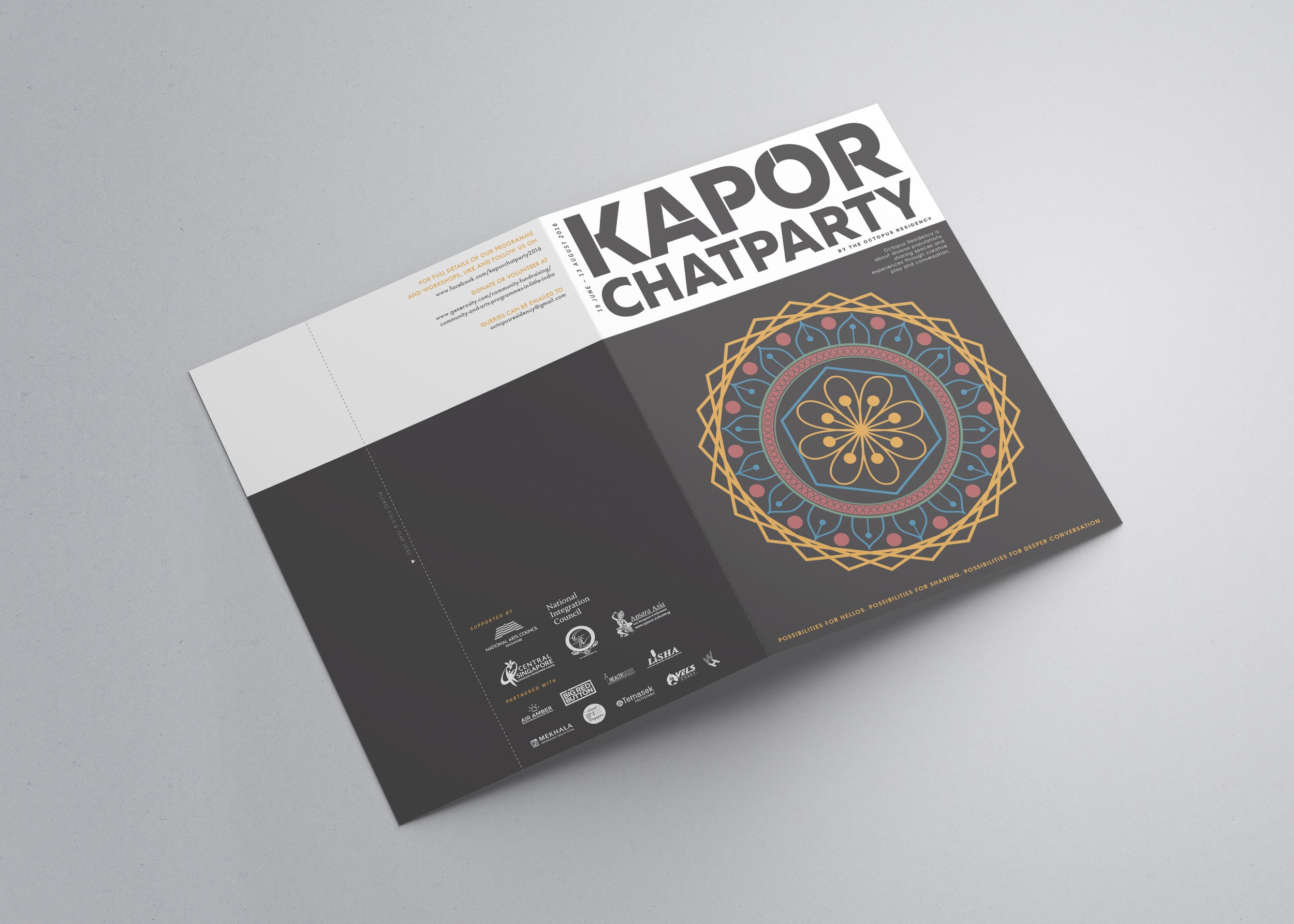
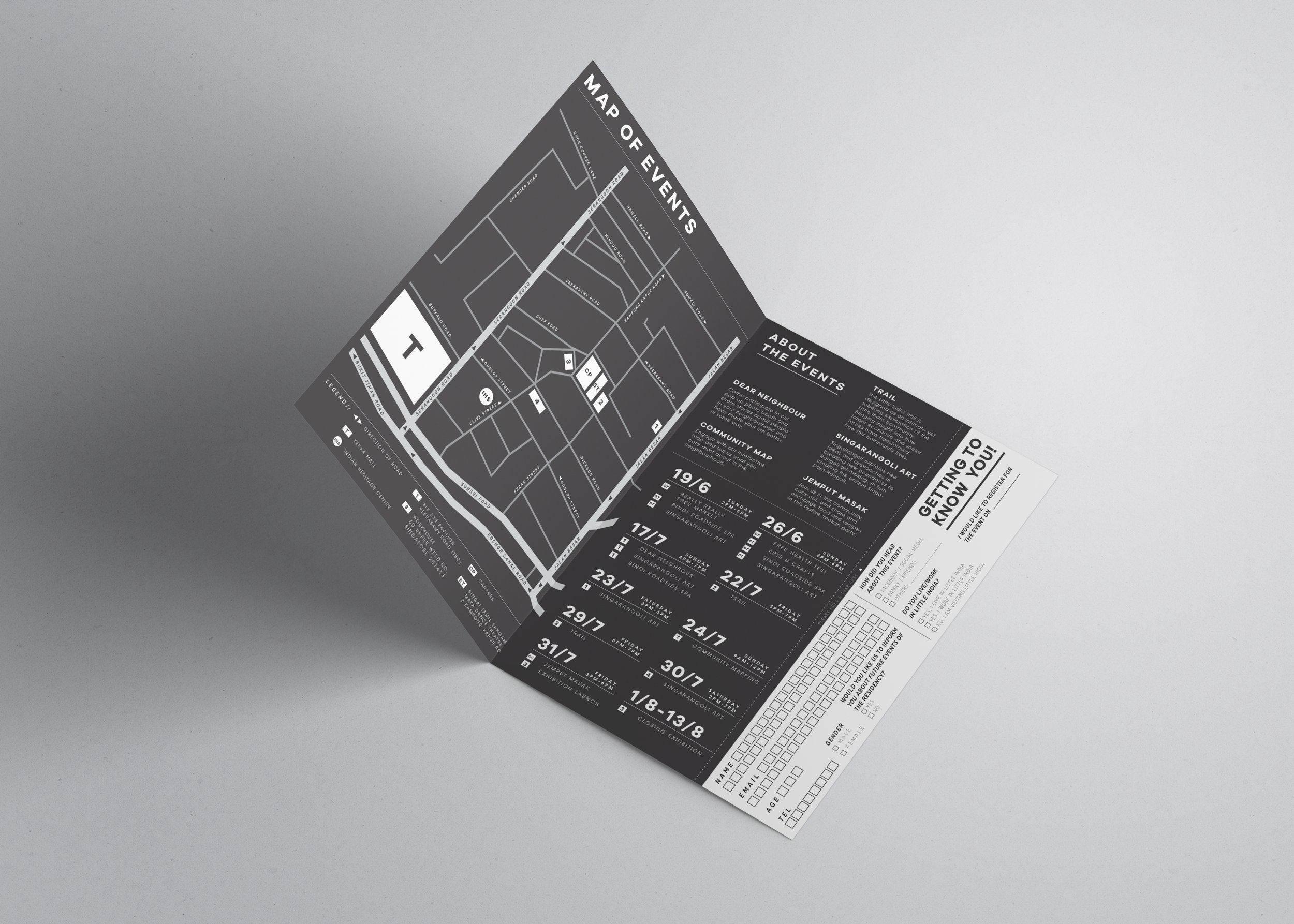
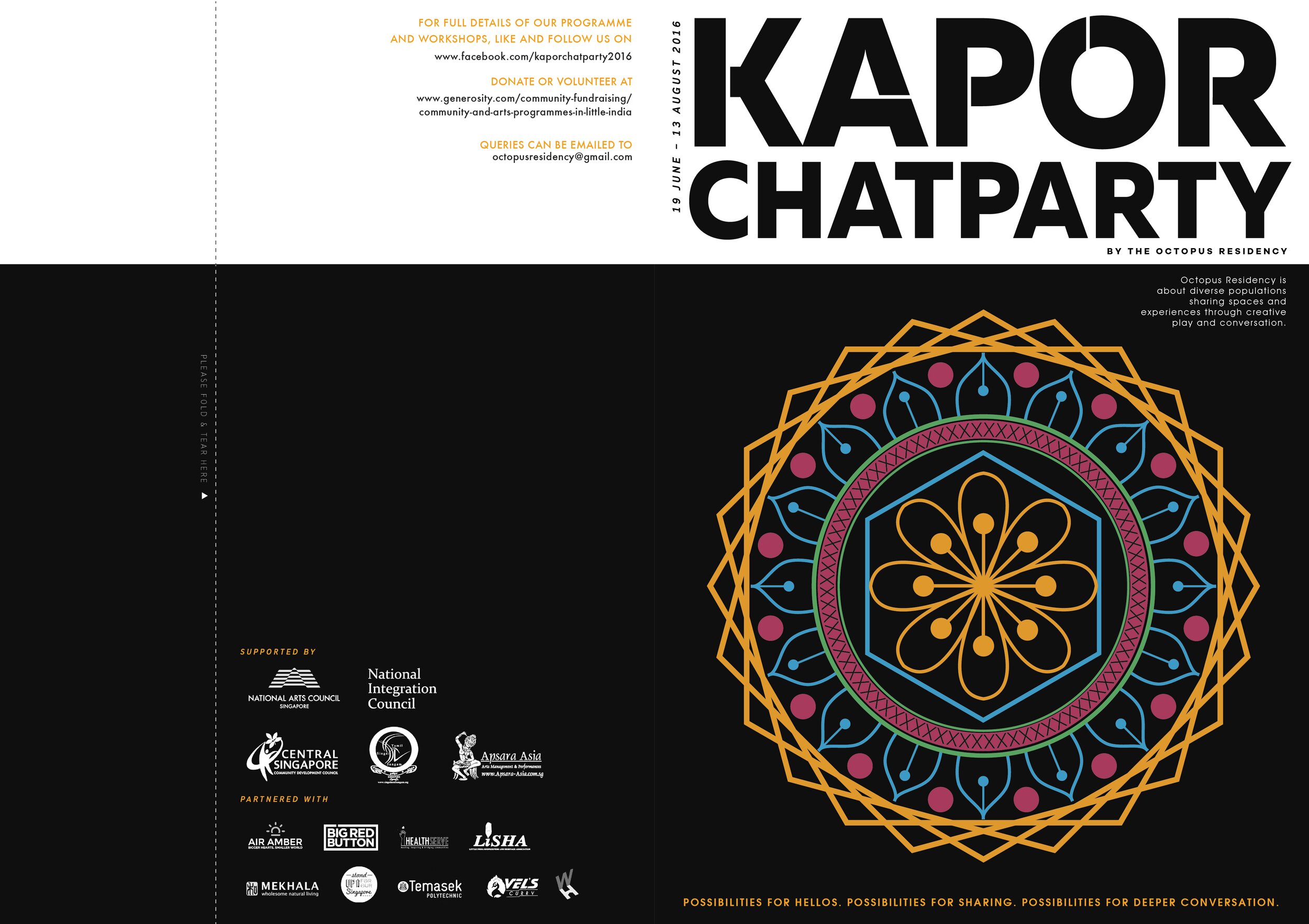
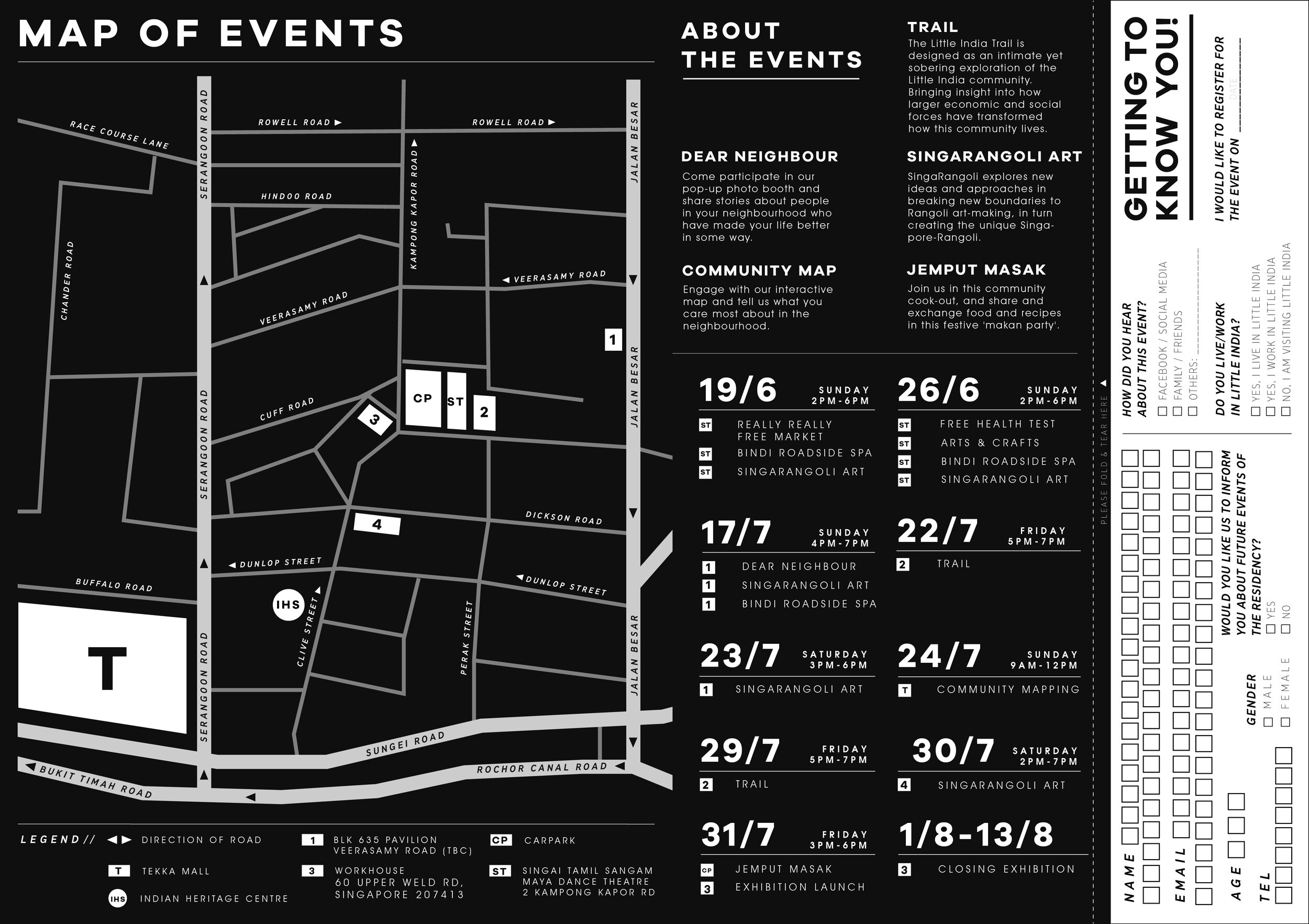
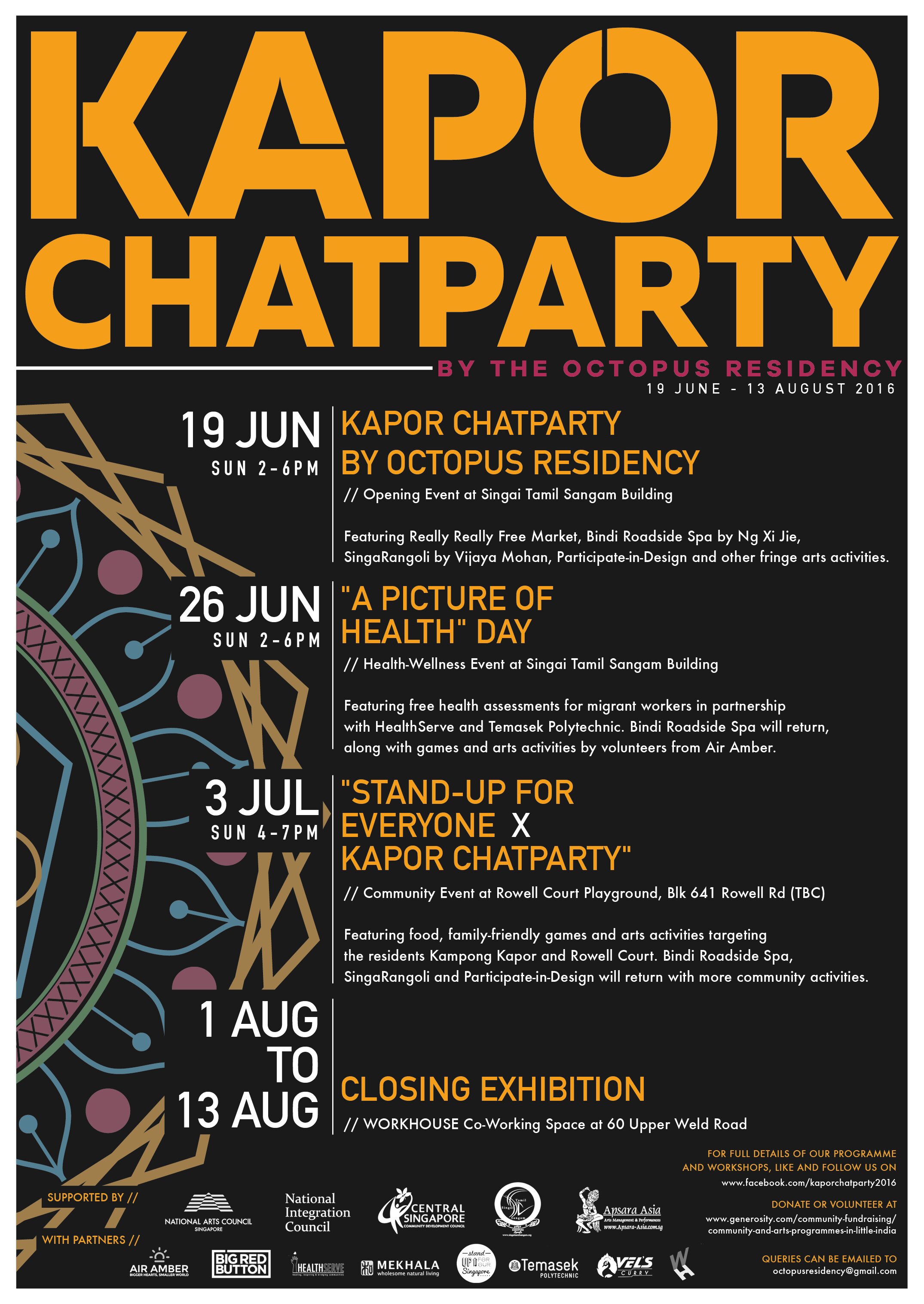
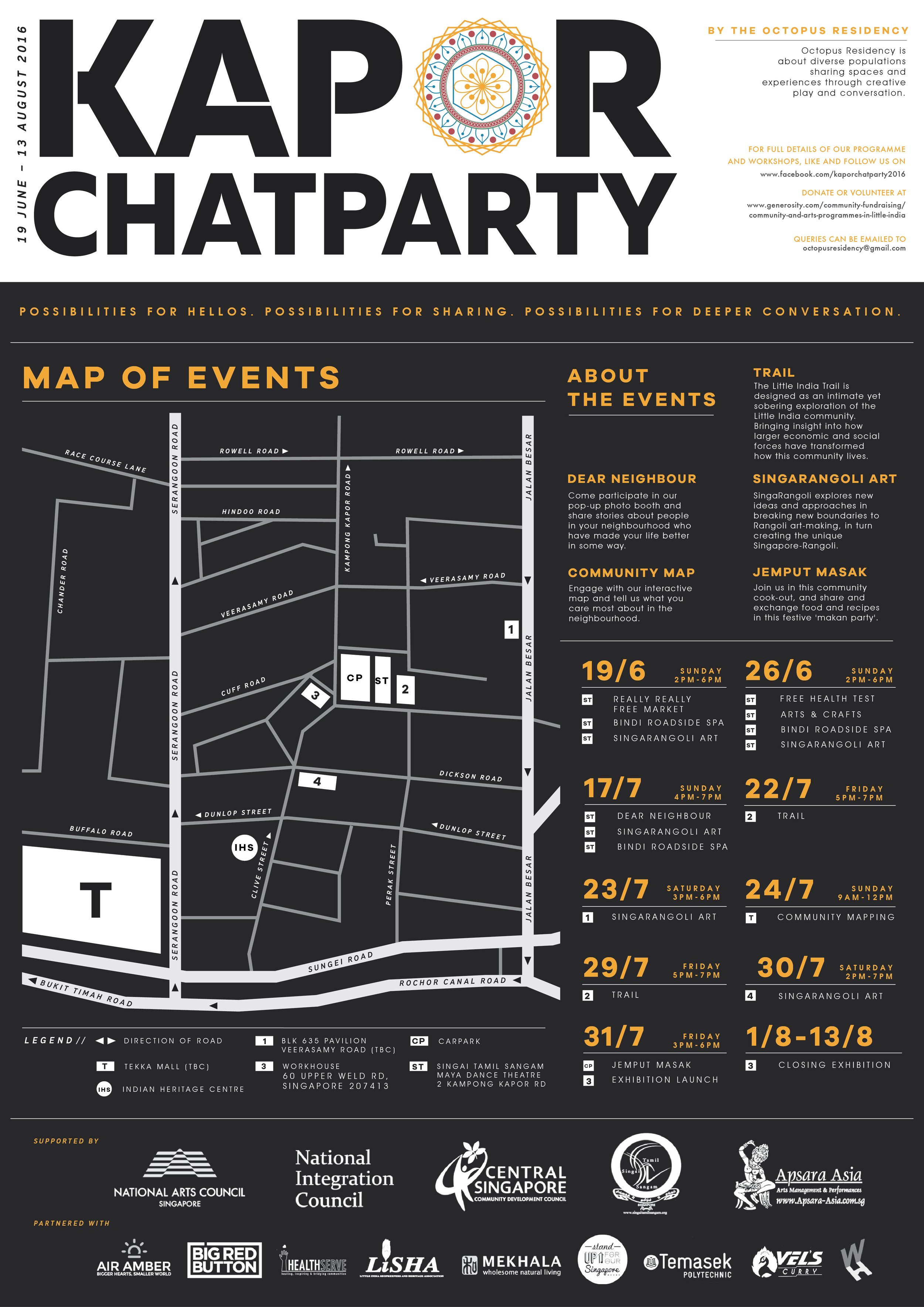
Project: Kapor Chatparty
-
Project: Kapor Chatparty -
Event KV + Brochure + Posters

A government sponsored community event to help locals and foreign workers from India commune and learn more about the Indian culture